Empowering People to Improve their Urban Transportation
Redesigning existing site to Communicate product Benefits And to increase consumer purchases in web app form
Client: Hoverboard Technologies
Industry: E-Commerce, Technology, Transportation
Project Type: Web app design
Duration: 3 Weeks + In Progress
Hoverboard Tech is an e-commerce company specializing in personal electric vehicles. It's goal is to better educate the public about the benefits of its electric skateboard products and sell the highest quality personal electric vehicles on the market.
CHALLENGE
Personal electric vehicles are still a new, evolving invention that the everyday commuter would not be familiar with. I was tasked with redesigning the website to inform users of personal electric vehicles and encourage them to take control of their commute with Hoverboard Tech's product.
USER PROBLEM
Most commuters rely on public transportation or their cars to travel. Public transportation can be delayed or can break down. Cars include expensive insurance rates, constant maintenance, and parking fees. When traveling for long periods of time over such a short distance, users become frustrated.
SOLUTION
I redesigned the site to teach new users about how personal electric vehicles can improve daily lives while providing an efficient purchase flow for an easy user checkout.
MY ROLE
My role was principal UX designer with additional specification on content strategy and visual design. I worked closely with the client and developers with constant focus on the information architecture and user feedback.

Mid fidelity wireframes, still undergoing usability testing and iterations while awaiting branding specifications.
DESIGN PROCESS: RESEARCH
"How am I wasting 30 minutes traveling just 2 miles?”
Through user interviews, competitive analysis, affinity mapping, and empathy mapping, I discovered that commuters are desperate for a quicker, more efficient way to travel short distances. They are not informed or knowledgeable enough of the options. And an unknown invention is not a desirable product.

Affinity Mapping
Through user surveys and interviews, I conducted affinity mapping to distill themes.

Competitive Analysis
Boosted Board - More site visits than other personal electric vehicle companies; web app designed.
OneWheel - Emphasized community forums and industrial vibe.

Persona
I developed an user persona to reference my designs and usability test screening.
DESIGN PROCESS: IDEATION
Educate the consumer and present a seamless purchase flow.
Hoverboard Tech's web app will allow users to become fully informed about the electric skateboards they are purchasing and how it compares to other modes of transportation or other personal electric vehicles. The mobile site will excite them to take more control over their commute methods through Hoverboard Tech's products. I was able to constantly usability test to make sure the redesign was understandable and efficient solving the client and user problems.

Site Map
With the development of our site map, I focused on the MVP in regards to the e-commerce flow to purchase.

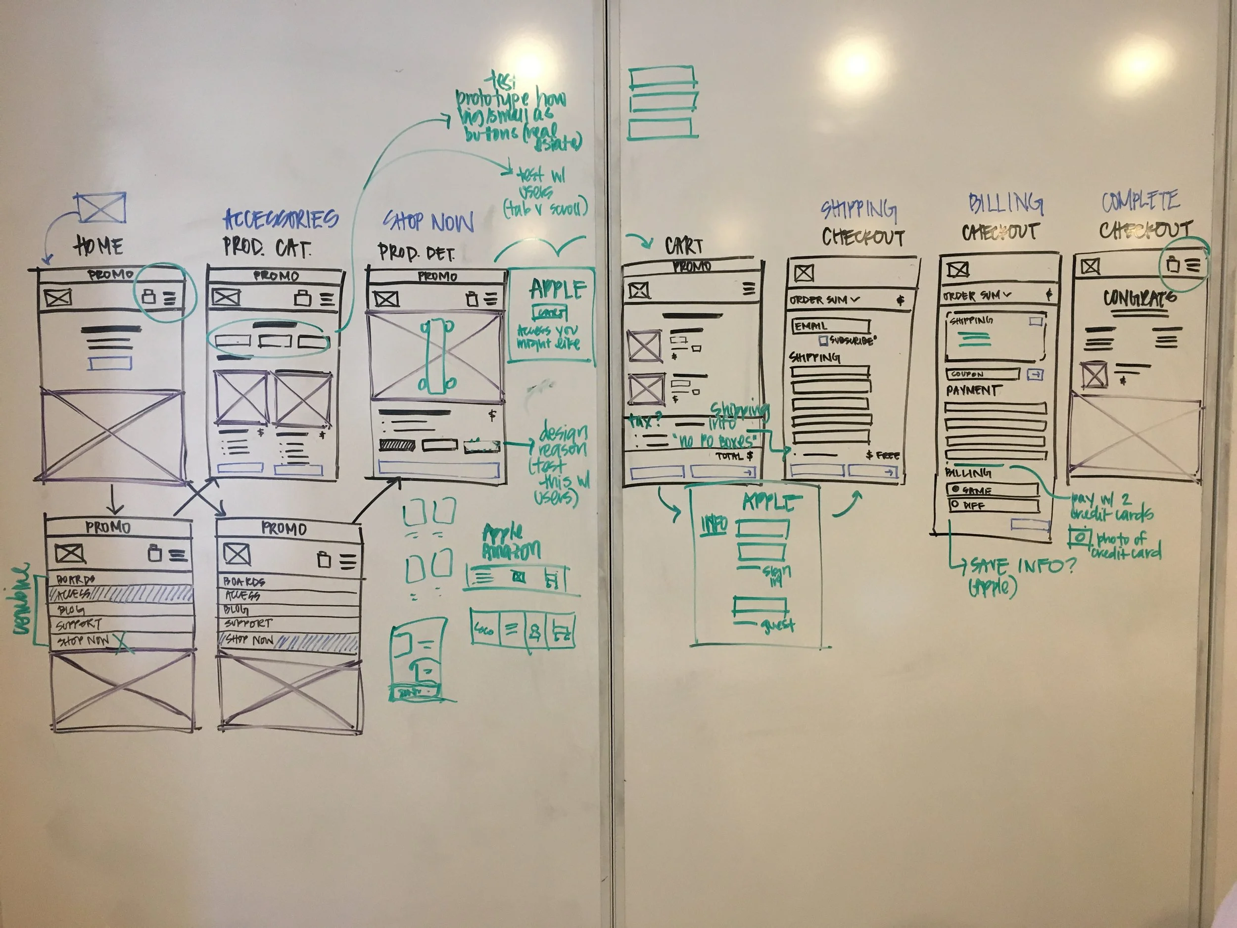
User Flow
I verified the user flow to usability test the 1) Board page 2) Product page 3) Cart page 4) Shipping page 5) Billing page and 6) Confirmation page.
Major Iterations
1. Switching the navigation to represent the cart to the right and menu to the left, best practices of other web app navigation.
2. Rewrote the copy of the landing page and brought down the call to action button so it would not overlap with the running video.
3. Included space for press mentions since the product has not undergone any reviews (consumers appreciate reviews).
4. On product page, included carousel of product photography and below it the product specifications. I wanted to keep the Add to Cart button within site of the product page (consumer does not have to scroll down to click it).

DESIGN PROCESS: DELIVERABLES
key research findings, persona, low fidelity wireframes, prototype
I focused the design on 1) informational content and 2) a simplistic pathway to purchase that allows users to be both informed shoppers and educated brand advocates.
Tools: Sketch3, InvisionApp, Procreate App
Results + reflections
Finding web app real estate for the information the client wanted to convey was tricky; I had to prioritize the key points of the product and why users should purchase it. I tried to keep the content exciting and understandable for both users familiar with the industry and users who have never seen the product.
Bringing users into the process at each milestone helped me iterate a better web app. Next steps would include improved information architecture and design of the Support and Blog pages.